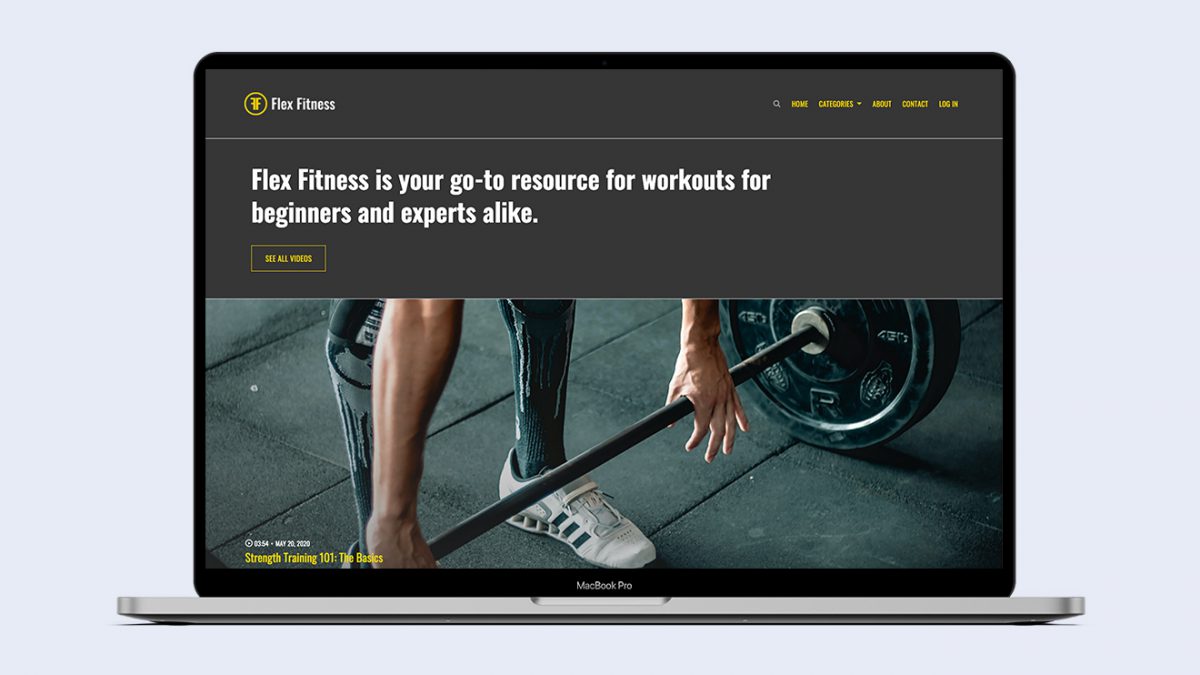
We just unveiled a brand new video website theme called “Spruce,” and we couldn’t be more excited about it. Beauty and charm, functionality and style — it’s got everything. We think the best way for you to get to know Spruce in all its glory is to hear from the person who designed it.
Sara, can we start by getting to know a little more about you?
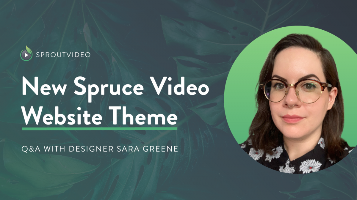
Sure! My name is Sara Greene, and I’m the Marketing Designer here at SproutVideo. I received my BFA in Fine Arts from the School of Visual Arts in 2008, along with a Certification in Graphic Design from Shillington School in 2011.
I’ve worn many hats throughout my graphic design career, including print, digital, user experience and interface (UX/UI), and motion design, covering a wide array of clientele and industries. At SproutVideo, I design collateral across our social media platforms, graphics for our How To Video series and live stream events, and I help build new user interfaces (UI), including our blog redesign in 2020 and our new Spruce video website theme.
Did you have a specific user in mind with this design?
Any type of user would enjoy this new theme, but the main users in mind for Spruce are videographers, content creators, production companies, and educators. Not only will they be capable of showcasing their portfolios, reels, or lessons, but they also have a place for potential prospects to reach out from within the site via the optional contact form.
B2C and B2B companies who want a centralized place to both maintain their brand and organize their video libraries will also greatly benefit from this theme. It’s especially ideal for things like employee onboarding, instructional videos, internal corporate videos, and more.
What was your process behind designing this theme?
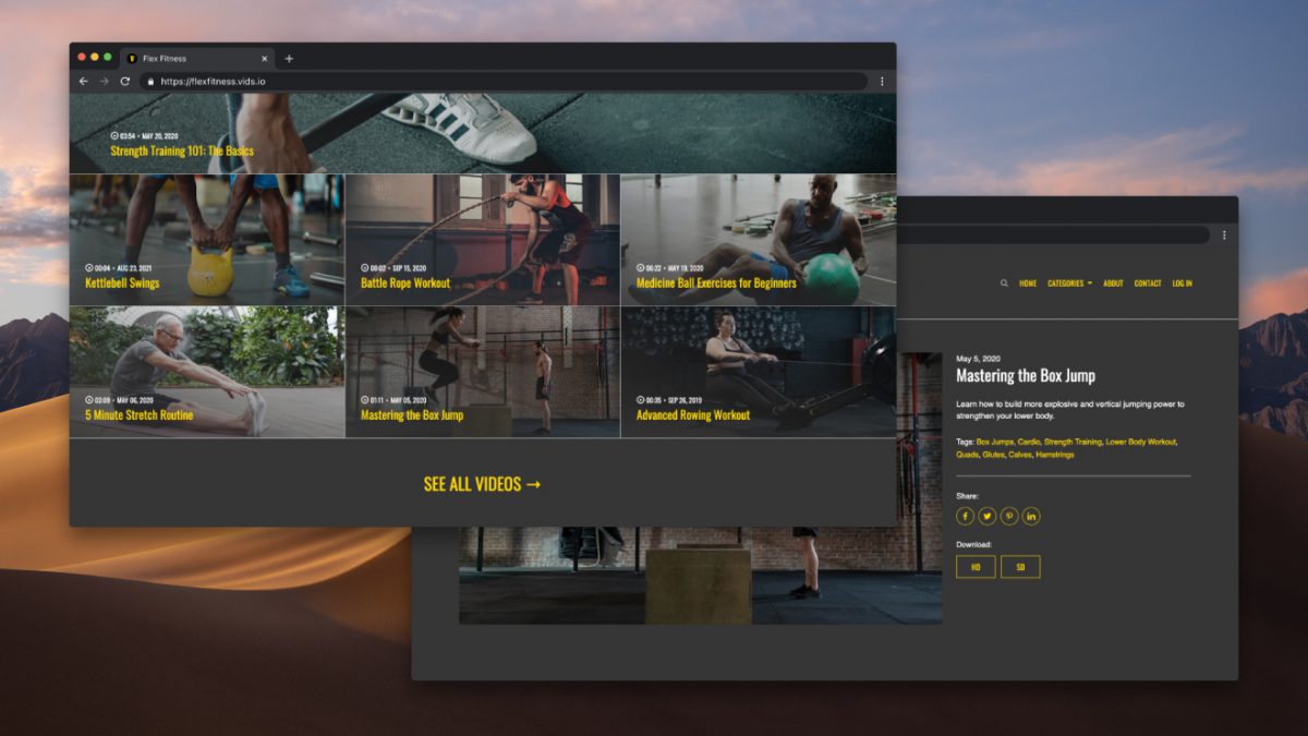
The product team approached me about designing a new theme, along with implementing some new features suggested by not only them, but by our own customers. After our initial discussions, my top priorities for Spruce were to achieve a modern, clean, flexible, visually impactful, versatile, user-friendly, and fully optimized theme for all screen sizes and devices. Keeping all these factors in mind, we certainly had our work cut out for ourselves, though the SproutVideo team could not be more pleased with the finished product.
What references or examples did you draw on while you were designing this theme?
I’m already very familiar with popular website building platforms for creating sites for friends, family, clients, and even myself, so their templates were absolutely an integral resource for this new theme, especially when it came to the customization options. I also spent a good amount of time endlessly scrolling through designers’ shots and projects on Dribbble to see how they’re pushing the envelope, so I referenced the many UI designs I’d saved into my collections on that platform.
My top priorities for Spruce were to achieve a modern, clean, flexible, visually impactful, versatile, user-friendly, and fully optimized theme for all screen sizes and devices.
How does the Spruce theme stand out from the others?
The versatility is really what makes Spruce a cut above the rest. No users like to feel limited by constraints, but we also acknowledge that an overabundance of options runs the risk of creating an unnecessarily complex theme. We feel the introduction of these new features strikes a nice balance between what our customers want and need, without compromising the integrity of our product.
What are your favorite new features?
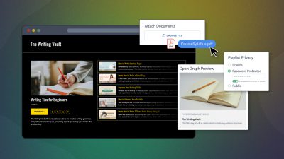
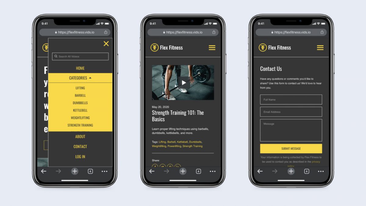
Font options, hands down! The product team and I decided to implement a handful of popular yet legible serif, sans serif, and display fonts for customers to choose from that are easy to mix and match. I am also partial to the optional introduction/bio portion of the homepage — such a great way to introduce yourself and your work to the viewer right away, with a simple call-to-action button to take to your page of choice.
How will this theme empower users?
User control and freedom is absolutely imperative when it comes to good UI design; you want to ensure the user is comfortable and confident interacting with your product, without feeling confused by inconsistent UI or unfamiliar jargon. This also means that if the user makes a mistake, they have easy access to reset or undo those changes within our site editor.
With these core principles already applied, Spruce will give our customers even more agency over the look and feel, giving them more power to tailor their video website to their exact needs.


