Choosing the right color schemes for your company and the content you produce is more important than many people think. The impact of color selections on the mood of consumers and the associations that are subconsciously made by certain color combinations can greatly affect the image your brand is projecting.
Here’s how to use color effectively in your videos to tell your company’s story, while still staying relevant and on-trend.
Trending Tones
Every year since 2008, Pantone has announced their Color of the Year. It’s a specific shade that representatives have selected in order to suit the perceived tone of the year ahead.
This year, the choice is 16-1546 Living Coral. It’s described as “an animating and life-affirming coral hue with a golden undertone that energizes and enlivens with a softer edge”. It’s playful, bold and expressive, without being too overpowering or loud.
Get ready to see a lot more of this shade this year – and maybe even find a way to use it for yourselves. You don’t have to stick with Living Coral, of course. It’s all about finding the colors that resonate with your brand.
So, how can color be used with greater intention in your videos? Glad you asked.
Influence the Mood of Your Content
Different colors portray different moods, and thus can be used to carefully engineer the tone of your video. Depending on what you are sharing with your audience, some colors will be more suited to your project. For instance, a lot of yellow imagery can appear warm and optimistic, but the use of grey tones feels calm and sleek.
Pantone’s Living Coral shade is a mixture of oranges and pinks, hence its warmth and “life-affirming” nature. Use this in your videos to appear confident and passionate about the services you’re advertising. Try pairing it with pale grays to provide an air of calm elegance, or pops of other pinks and oranges for optimism and creativity.
This could even relate to the shades or tones of the colors you’ve chosen. For instance, numerous advertisements, movies and short films use black and white with a pop of color highlighting an important object or moment. It helps our brains to hone in on what is most important. Put this to the test in your own videos to pull the focus to a particular element, product or moment.
Different Colors and Their Meaning
To help you get started, here is a summary of the types of emotions different colors typically inspire:
- Red: bold, exciting, and passionate, but also strength and anger
- Orange: cheerful, confident, warm
- Yellow: warm, happy, optimistic
- Green: natural, growth, health, balance
- Blue: strong, trustworthy, calming
- Purple: luxurious, creative, spiritual
- Pink: love, hope, romanticism, sensitivity
- Brown: safety, home, seriousness
- Gray: calm, minimal, sleek
- White: innocence, calm, clean
- Black: sophistication, mystery
The right mix of colors is highly subjective and nuanced. Play with different options to see what works best for your brand or project.
Branding
When sharing your content online, it remains important to have consistent branding so that you are recognizable and easily remembered. It’s worthwhile to ensure your color choices are consistent across all of your media, especially video.
For example, if your logo is primarily green, white, and brown, make sure you transfer these colors across into your video. This could be for text and subtitles, or even the color scheme on set. If you are choosing to make animated content, you have even more freedom with the colorful elements you might use.
A great example of this is Apple. Apple’s products are undeniably recognizable with so many of us using their products every day. Their branding is so powerful that they can create advertisements without the need for excessive words or even putting their name to it.
Most of their product videos feature simple, elegant color schemes, and the above video is no exception. It’s largely monochromatic with a few dramatic flashes of color here and there.
Minimalistic advertising is powerful and intriguing, and much of their success is down to their simple color and design choices. Nike uses a similar tactic but with a heavy use of black backgrounds and bright pops of color. The resulting contrast feels sophisticated and striking.
Visual Impact
Color is an important visual element, and can be particularly impactful and memorable when used with intention. Matching color palettes is crucial (Pantone even suggest a variety of palettes to complement their Living Coral). Color blocking the scenes in your videos is another way to pack a visual punch – Wes Anderson does it for a reason.
Take this music video for singer-songwriter Tessa Violet’s song ‘Bad Ideas’. Every shot is color-coded and the matching elements are pleasing to see. Techniques like this make your content more memorable even if only viewed in passing.
Creating video with impactful visuals can grow your brand recognition because viewers are more likely to recall the striking imagery. By standing out, your company will be more like to be top-of-mind for your viewers. (More about upping your brand recognition here.)
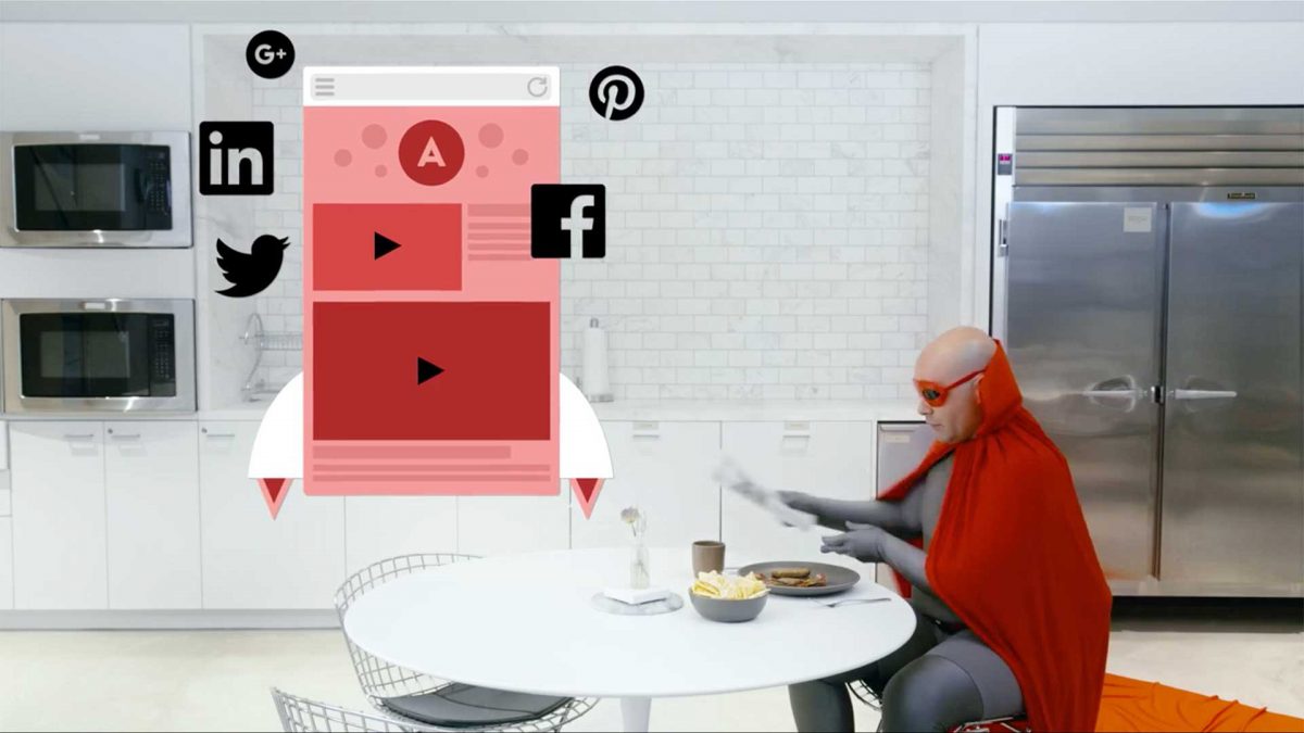
Colorful Superheroes
A great example of using color for visual impact is the Superhero series we produced to promote the SproutVideo platform. As you can see in the video showcasing our video website features, we used bold colors against a neutral office setting to create contrast and capture attention.
We also intentionally coordinated our heroes’ costumes with the animations in the videos to help reinforce the “superpowers” they represented, such as video marketing, video privacy, and more.
Make this year a colorful one for you and your business. Embracing the right color palette allows you to go above and beyond with video content your audience is sure to love.
Keep us in the know with how your color palette experiments grow at @sproutvideo, or in the comments below!